


Table of contents
In web development, CSS (Cascading Style Sheets) is used to style the elements of a website. To control the layout of elements on a web page, the position property of CSS is used. In this blog, we will learn about CSS positions and their types.
Let's start!
CSS position Property
The CSS position property is used to control the position of an element on a webpage. It defines how an element should be positioned relative to its containing element or the viewport.
Following are the possible values for the position property:
static
This is the default value for all HTML elements' positioning. In this positioning, elements are positioned in the normal flow of the document which means they are positioned one after another following the HTML structure. The positioning of elements in this mode is determined by their margins and paddings.
Applying the top, right, bottom, or left properties to a statically positioned element will have no effect. z-index also does not apply to static elements.
Syntax:
position: static;
For example:
<!DOCTYPE html>
<html lang="en">
  <head>
    <meta charset="UTF-8" />
    <meta http-equiv="X-UA-Compatible" content="IE=edge" />
    <meta name="viewport" content="width=device-width, initial-scale=1.0" />
    <link rel="stylesheet" href="style.css" />
    <title>CSS position property</title>
  </head>
  <body>
    <div class="box box1">Box1</div>
    <div class="box box2">Box2</div>
    <div class="box box3">Box3</div>
  </body>
</html>
CSS:
.box {
  height: 100px;
  width: 100px;
  border-radius: 10px;
  margin: 10px;
  text-align: center;
  color: white;
  padding: 10px;
}
.box1 {
  background-color: red;
}
.box2 {
  background-color: blue;
  position: static;
}
.box3 {
  background-color: green;
}
Output:
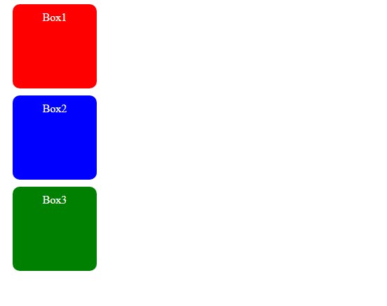
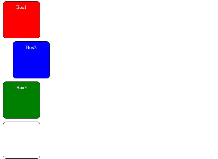
In the above example, we have 3 boxes, all having the same height and width. The position: static; property is applied only to the second box. However, it doesn't differ the layout of the second box with the other two boxes because static is the default value for all of the HTML elements.
relative
With position: relative elements follow their normal document flow but can be shifted from their original position. This can be achieved using the top, right, bottom and left properties.
With this property, surrounding elements won’t be affected, but there will be space where the element would have been in the static position.
Syntax:
position: relative;
For example:
<!DOCTYPE html>
<html lang="en">
  <head>
    <meta charset="UTF-8" />
    <meta http-equiv="X-UA-Compatible" content="IE=edge" />
    <meta name="viewport" content="width=device-width, initial-scale=1.0" />
    <link rel="stylesheet" href="style.css" />
    <title>CSS position property</title>
  </head>
  <body>
    <div class="box box1">Box1</div>
    <div class="box box2">Box2</div>
    <div class="box box3">Box3</div>
  </body>
</html>
CSS:
.box {
  height: 100px;
  width: 100px;
  border-radius: 10px;
  margin: 10px;
  text-align: center;
  color: white;
  padding: 10px;
}
.box1 {
  background-color: red;
}
.box2 {
  background-color: blue;
  position: relative;
  top: 20px;
  left: 50px;
}
.box3 {
  background-color: green;
}
Output:
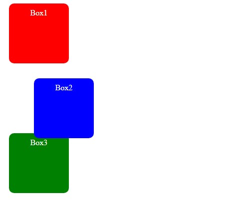
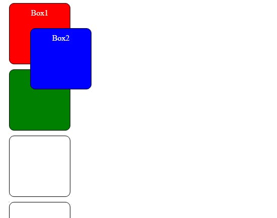
In the above example, the second box is shifted 20 pixels down (using the top property) and 50 pixels to the right (using the left property). The shifted box does not affect the position of surrounding elements (box 1 and box 3).
absolute
With position: absolute elements do not follow the normal flow of the document. The element is positioned relative to its closet positioned ancestor (an element with the positioning of relative, absolute, fixed, or sticky).
Syntax:
position: absolute;
For example:
<!DOCTYPE html>
<html lang="en">
  <head>
    <meta charset="UTF-8" />
    <meta http-equiv="X-UA-Compatible" content="IE=edge" />
    <meta name="viewport" content="width=device-width, initial-scale=1.0" />
    <link rel="stylesheet" href="style.css" />
    <title>CSS position property</title>
  </head>
  <body>
    <div class="box box1">Box1</div>
    <div class="container">
      <div class="box box2">Box2</div>
    </div>
    <div class="box box3">Box3</div>
  </body>
</html>
CSS:
.box {
  height: 100px;
  width: 100px;
  border-radius: 10px;
  margin: 10px;
  text-align: center;
  color: white;
  padding: 10px;
}
.container {
  border: 3px solid black;
  height: 200px;
  width: 200px;
  position: relative;
}
.box1 {
  background-color: red;
}
.box2 {
  background-color: blue;
  position: absolute;
  top: 30px;
  left: 50px;
}
.box3 {
  background-color: green;
}
Output:
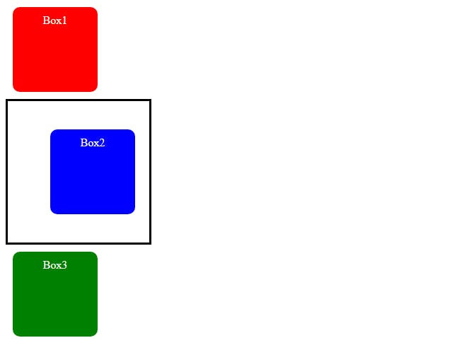
In the above example, the second box is inside a container. The position of the container is set to relative and the position of the second box is set to absolute and the box is shifted 30 pixels down (using the top property) and 50 pixels to the right (using the left property). The container is the ancestor of the second box.
Now what if there is no ancestor?
Then the element will be positioned relative to the viewport.
For example:
<!DOCTYPE html>
<html lang="en">
  <head>
    <meta charset="UTF-8" />
    <meta http-equiv="X-UA-Compatible" content="IE=edge" />
    <meta name="viewport" content="width=device-width, initial-scale=1.0" />
    <link rel="stylesheet" href="style.css" />
    <title>CSS position property</title>
  </head>
  <body>
    <div class="box box1">Box1</div>
    <div class="box box2">Box2</div>
    <div class="box box3">Box3</div>
  </body>
</html>
CSS:
.box {
  height: 100px;
  width: 100px;
  border-radius: 10px;
  margin: 10px;
  text-align: center;
  color: white;
  padding: 10px;
}
.box1 {
  background-color: red;
}
.box2 {
  background-color: blue;
  position: absolute;
  top: 30px;
  left: 50px;
}
.box3 {
  background-color: green;
}
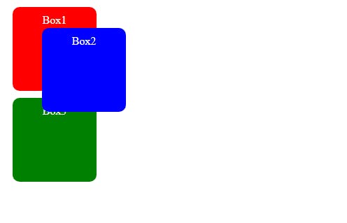
Output:
fixed
With position: fixed elements are positioned relative to the viewport and remain fixed even when the page is scrolled.
Syntax:
position: fixed;
For example:
<!DOCTYPE html>
<html lang="en">
  <head>
    <meta charset="UTF-8" />
    <meta http-equiv="X-UA-Compatible" content="IE=edge" />
    <meta name="viewport" content="width=device-width, initial-scale=1.0" />
    <link rel="stylesheet" href="style.css" />
    <title>CSS position property</title>
  </head>
  <body>
    <div class="box box1">Box1</div>
    <div class="box box2">Box2</div>
    <div class="box box3">Box3</div>
    <div class="box"></div>
    <div class="box"></div>
    <div class="box"></div>
    <div class="box"></div>
    <div class="box"></div>
    <div class="box"></div>
    <div class="box"></div>
    <div class="box"></div>
  </body>
</html>
CSS:
.box {
  height: 100px;
  width: 100px;
  border-radius: 10px;
  margin: 10px;
  text-align: center;
  color: white;
  padding: 10px;
  border: 1px solid black;
}
.box1 {
  background-color: red;
}
.box2 {
  background-color: blue;
  position: fixed;
  top: 50px;
  left: 50px;
}
.box3 {
  background-color: green;
}
Output:
In the above example, the position of the second box will be fixed, even if you scroll down the page.
With this property, unlike position: relative; there will be no space where the element would have been in the static position.
sticky
With position: sticky elements are positioned based on the user's scroll position. It behaves like a relative element until the user scrolls to a certain position, after which it becomes fixed relative to its containing element or the viewport.
Syntax:
position: sticky;
For example:
<!DOCTYPE html>
<html lang="en">
  <head>
    <meta charset="UTF-8" />
    <meta http-equiv="X-UA-Compatible" content="IE=edge" />
    <meta name="viewport" content="width=device-width, initial-scale=1.0" />
    <link rel="stylesheet" href="style.css" />
    <title>CSS position property</title>
  </head>
  <body>
    <div class="box box1">Box1</div>
    <div class="box box2">Box2</div>
    <div class="box box3">Box3</div>
    <div class="box"></div>
    <div class="box"></div>
    <div class="box"></div>
    <div class="box"></div>
    <div class="box"></div>
    <div class="box"></div>
    <div class="box"></div>
    <div class="box"></div>
  </body>
</html>
CSS:
.box {
  height: 100px;
  width: 100px;
  border-radius: 10px;
  margin: 10px;
  text-align: center;
  color: white;
  padding: 10px;
  border: 1px solid black;
}
.box1 {
  background-color: red;
}
.box2 {
  background-color: blue;
  position: sticky;
  top: 50px;
  left: 50px;
}
.box3 {
  background-color: green;
}
Output:
In the above example, the second box will behave like a relative element until it reaches the position top: 50px; on scrolling, then it will behave like a fixed element.
Conclusion
The position property, in CSS, determines the positioning of an element relative to its containing element or the viewport.
The position property has the following possible values:
static: This is the default positioning for all HTML elements. Elements are positioned in the normal flow of the document and follow the HTML structure.
relative: Elements with position: relative follow their normal document flow but can be shifted from their original position.
absolute: With position: absolute elements do not follow the normal flow of the document. The element is positioned relative to its closet positioned ancestor. If there is no ancestor, then the element will be positioned relative to the viewport.
fixed: Elements with position: fixed are positioned relative to the viewport and remain fixed even when the page is scrolled.
sticky: Elements with position: sticky are positioned based on the user's scroll position.
By having a solid grasp of the position property we can attain the desired layouts and interactions in our web pages.
Thanks for reading.
Keep Coding!
For more content click here!